Week 18
05/27/15
Create ONE collage of these retiring faculty and staff. WAIT. There's more coming.
Create ONE collage of these retiring faculty and staff. WAIT. There's more coming.


05/26/15
Create a horizontal, 11" x 8.5" graphic design celebrating BVHS' 50th Anniversary - 1966-2016.
Create a horizontal, 11" x 8.5" graphic design celebrating BVHS' 50th Anniversary - 1966-2016.


Week 17
05/22/15
Create 5 individual graphic design, 11" x 8.5" artwork combining the winning student's photo, their winning entry, and text explaining what they won.
Create 5 individual graphic design, 11" x 8.5" artwork combining the winning student's photo, their winning entry, and text explaining what they won.
5. Paolo Tellez
|
|
|


Create ONE horizontal, 11" x 8.5" graphic design celebrating the 5 BVH Winners in the 2015 Digital Media Showcase.
|
|
|


5/21/15
Create a horizontal, 11' x 8.5' artwork on this Saturday's Prom and theme: Passport to Paradise. May 24, 2105, 7-11p.m.
Create a horizontal, 11' x 8.5' artwork on this Saturday's Prom and theme: Passport to Paradise. May 24, 2105, 7-11p.m.


Create 5 individual graphic design, 11" x 8.5" artwork combining the winning student's photo, their winning entry, and text explaining what they won.
4. Chris Melhorn & Diego Lobato
4. Chris Melhorn & Diego Lobato
|
|
|


05/20/15
Create 5 individual graphic design, 11" x 8.5" artwork combining the winning student's photo, their winning entry, and text explaining what they won.
3. Cinthia Sanchez
Create 5 individual graphic design, 11" x 8.5" artwork combining the winning student's photo, their winning entry, and text explaining what they won.
3. Cinthia Sanchez
|
|
|


05/19/15
Create 5 individual graphic design, 11" x 8.5" artwork combining the winning student's photo, their winning entry, and text explaining what they won.
2. David Ochoa, Chili Valdivia and Melanie McMeans.
Create 5 individual graphic design, 11" x 8.5" artwork combining the winning student's photo, their winning entry, and text explaining what they won.
2. David Ochoa, Chili Valdivia and Melanie McMeans.
|
|
|


05/18/15
Create 5 individual graphic design, 11" x 8.5" artwork combining the winning student's photo, their winning entry, and text explaining what they won.
Create 5 individual graphic design, 11" x 8.5" artwork combining the winning student's photo, their winning entry, and text explaining what they won.
1. Ysabelle Moon
|
|
|


week 16
05/15/15
Excused for TA (Picture selection for video)
Excused for TA (Picture selection for video)
05/14/15
3. Best of Spring 2015 Slideshow on Homepage.
3.1 For every slide here, put the date as a caption on each one. If it's too old, just estimate the date.
3.2 Give each one a title, or just "Untitled"
i.e. Big Dreams (2015)
3.3 Pick TEN of your best artwork this Spring Semester and upload it here. You can keep updating which 10 up till the last day of school.
3.4 On the bottom gallery, take a screenshot of each artwork - the final artwork + original source images. Sample is located above.
|
|


05/13/15
Excused for TA (Picture selection for video)
Excused for TA (Picture selection for video)
05/12/15
1.1 Follow Tori Hallmark's tutorial on how to juxtapose an image, and then upload that artwork here. Due: ASAP.
1.1 Follow Tori Hallmark's tutorial on how to juxtapose an image, and then upload that artwork here. Due: ASAP.


2. Turn a Color Photo to B&W by David Ochoa (Tutorial).
Go to Image. Adjustment. Click hue/saturation. Turn Saturation all the way down.
2.1 Citation. Add who is the photographer/website/source of the original color photo.
Go to Image. Adjustment. Click hue/saturation. Turn Saturation all the way down.
2.1 Citation. Add who is the photographer/website/source of the original color photo.


05/11/15
1. May Tutorial. Pick one of your best artwork that you're willing to share and teach others to create. Create a step-by-step guide on how to create it. Recommend you upload the original source file (i.e. photoshop, ...).
1. May Tutorial. Pick one of your best artwork that you're willing to share and teach others to create. Create a step-by-step guide on how to create it. Recommend you upload the original source file (i.e. photoshop, ...).
3D Effect
|
Step 1: Open the image you want to make the 3D effect out of. (I will choose Earth Day image because I used 3D effect on the background)
|
|


|
Step 2: Duplicate the opened background layer by Ctrl+J twice.
|
|

|
Step 3: Go to layer one cop and right click. Open 'Blending Options'.
|
|

|
Step 4: Do step 3 on 'Layer 1' first and deselect the 'R' on channels, click okay. Then do step 3 to 'Layer 1 copy' and deselect both 'G' and 'B' on channels.
|
|


|
Step 5: Now select Layer 1 and then select Move tool and move the picture the right. Then select the Layer 1 copy and move it the left. If you do left first then do right second, you'll see the 3D effect in the last move. Now save your pic and use it when ever!
|
|


week 15
05/08/15
Mother's Day. Create an artwork celebrating Mother's Day. Must reflect 40 min. or more of work. Due: asap.
Mother's Day. Create an artwork celebrating Mother's Day. Must reflect 40 min. or more of work. Due: asap.


05/07/15
Powerpoint Project #5: HOMAGE
Powerpoint Project #5: HOMAGE


| maurits_cornelis_escher.pptx |
5/6/15
Graphic Design:
Happy Nurses Week - Ms. Paola Garcia
- Design a project in celebration of Nurses Day/Week.
Graphic Design:
Happy Nurses Week - Ms. Paola Garcia
- Design a project in celebration of Nurses Day/Week.


05/05/15
Powerpoint Project #5
Powerpoint Project #5
| maurits_cornelis_escher.pptx |

05/04/15
Powerpoint Project #5: Artist.
Powerpoint Project #5: Artist.
| maurits_cornelis_escher.pptx |

Week 14
04/29/15
Your Choice. Be sure to add the Reflection and Self-Grade section.
Your Choice. Be sure to add the Reflection and Self-Grade section.
|
|
|


|
|
|


I picked "Your choice" for this week because I wanted to try a new editing technique I learned while self teaching myself to edit. I believe you call this double exposure but in the tutorial it said "Camouflage". The model in the picture is CL from 2NE1 and the background I used to camouflage her into was a dry tree or a cliff. I really like this artwork because it has a lot of detail in it like the tree itself is very beautiful. I believe I should get an A.
Week 13
04/22/15
Create an artwork celebrating:
Earth Day
Create an artwork celebrating:
Earth Day


Week 12
04/17/15
MORP WEEK- 50's
MORP WEEK- 50's


04/16/15
National Teacher Day
National Teacher Day


04/15/15
Your Choice. Be sure to add the Reflection and Self-Grade section.
Your Choice. Be sure to add the Reflection and Self-Grade section.


This edit was inspired by everyday people's conversation. Everyone asks the words, "How are you?" and the answer is always "I'm okay" when you are really asking for help inside. This picture is made with pixlr.com . I used tools like filter, brushes, opacity, posterize, threshold and text. I believe that I deserve an A for this artwork because it mostly shows and my original art that the photograph I used and I made it simple so people can understand the meaning.
4/14/15
Recreation. Pick an artwork from any artist we've covered this school year (Fairey, Warhol, Kahlo, ...). Upload that artwork, and then try as much as possible to recreate that artwork to learn their style and technique. You can do your own spin and turn this to an homage.
Recreation. Pick an artwork from any artist we've covered this school year (Fairey, Warhol, Kahlo, ...). Upload that artwork, and then try as much as possible to recreate that artwork to learn their style and technique. You can do your own spin and turn this to an homage.


4/13/15
Artsfest. Write 2 50-word critiques about 2 different artworks.
Artsfest. Write 2 50-word critiques about 2 different artworks.
Week 11
04/10/15
Your Choice. Be sure to add the Reflection and Self-Grade section.
Your Choice. Be sure to add the Reflection and Self-Grade section.


This picture is a book cover I made for a fan fiction on Wattpad called Silent Love. It is written by a person who wanted someone to make a cover for her story and I participated in it. She wanted it cold and mysterious and with the model (Leo of Vixx) looking cold too. I used pixlr.com to do this edit since I don't have Photoshop. I think I deserve an A because this artwork was created with complexity and meaning and the original pictures were change a lot for it to be a proper book cover.
04/10/15
Critique #10 and 11. Wait for directions. Just for Georgia O"keeffe and Cindy Sherman, write on ONE of the four segments. Wait for directions in class.
Critique #10 and 11. Wait for directions. Just for Georgia O"keeffe and Cindy Sherman, write on ONE of the four segments. Wait for directions in class.
|
10. Georgia O'Keeffe.

DESCRIBE: In this picture I see three fully bloomed Jimsonweed and one that hasn't bloomed fully. There are colors like white and light blue in the background and colors of off white, yellow, green and black in the foreground in this artwork. It was created in 1936 and the title of the artwork is "Jimsonweed" which I believe is the type of flower, also known as Devil's snare or Datura. The artwork space is filled with an extreme close up or emphasis of the flower.
|
11. Cindy Sherman.

ANALYZE: In this artwork, Cindy Sherman has used emphasis, proportion and balance. Emphasis is used to emphasize or get the viewers attention on this one painting of her "Society Portraits" collection. Proportion is used as portrait describes the size, location and the amount of the elements in the artwork clearly. Finally, Balance is used because the lines, shapes and colors of the artwork, which are the elements of art are arranged very well in the portrait.
|
04/09/15
Your Choice. Be sure to add the Reflection and Self-Grade section.
Your Choice. Be sure to add the Reflection and Self-Grade section.


This image "Love me for me" is made to spread the message of loving each other for not how he or she looks but for his or her's personality and lifestyle. I made this picture using Photoshop tools, such as brushes, filters and text. I also used curves so I can change the Blue of the picture to give it an old look. I think I deserves and A because the original pictures are changed and created into a meaningful and original artwork.
04/08/15
Recreation. Pick an artwork from any artist we've covered this school year (Fairey, Warhol, Kahlo, ...). Upload that artwork, and then try as much as possible to recreate that artwork to learn their style and technique. You can do your own spin and turn this to an homage.
Recreation. Pick an artwork from any artist we've covered this school year (Fairey, Warhol, Kahlo, ...). Upload that artwork, and then try as much as possible to recreate that artwork to learn their style and technique. You can do your own spin and turn this to an homage.
Recreation of Andy Warhol


04/07/15
Your Choice. Be sure to add the Reflection and Self-Grade section.
Your Choice. Be sure to add the Reflection and Self-Grade section.


Lee Jinki (ONEW) is the leader of the group SHINee and as the leader and a very smart person he gives out very good words. This is one quote that I respect of him. For constructing this picture I used a lot of textures. I think I deserve an A because I have hidden the original work as much as possible.
04/06/15
Use the Elements of Art to design an artwork illustrating their Spring Break. The best ones will be compiled into a video to be shown on BVBulletin. Due: ASAP.
Use the Elements of Art to design an artwork illustrating their Spring Break. The best ones will be compiled into a video to be shown on BVBulletin. Due: ASAP.

|
I couldn't take a proof shot because my Photoshop was accidentally closed with out saving.
|


|
|
|


week 10
03/20/15
Your Choice. Be sure to add the Reflection and Self-Grade section.
Your Choice. Be sure to add the Reflection and Self-Grade section.


I made this random edit for the kpop group SHINee's Kim Kibum (Key) that has the best fashion sense among everyone I know. I made the background myself including the frame. I used the caption "Love is pain" for a better feel to the picture according to his facial expressions that looks emotionless and depressed. I wanted to make the picture as simple as possible. I think I deserve an A because I have changed the original pictures as much as possible and made it all one.
03/19/15
Your Choice. Be sure to add the Reflection and Self-Grade section.
Your Choice. Be sure to add the Reflection and Self-Grade section.


The following edit was made for a young entertainer from YG Entertainment company, Lee Chaerin (CL), who is a role model for me under my standards of beauty. She is a very beautiful person inside and out. I made this edit using brushes, overlaying, curves and the website called Wigflip to make the speech bubble saying "CL". I think I deserve an A because I have hidden the original images as much as possible with curves and texture.
03/18/15
Your Choice. Be sure to add the Reflection and Self-Grade section.
Your Choice. Be sure to add the Reflection and Self-Grade section.


This picture is an edit made for EXO's Suho. I have made the background with many different pictures for both versions I made at home and during class. The reason that the background is so colorful is because this person has a big heart and also has a lot of responsibility to handle as the leader of the group. I changed the pictures from first to second one because I thought it was a bit dull. I think I deserve an A because although I used others work I have changed it as much as possible so the original work is not seen and made to one of my own.
3/17/15
Create at least ONE or more artwork in any category from the district competition website:
http://vapa.sweetwaterschools.org/digital-media/digital-media-showcase/
It can be a new one or an existing artwork created this school year. Due: end of class, W., 3/18/15.
Create at least ONE or more artwork in any category from the district competition website:
http://vapa.sweetwaterschools.org/digital-media/digital-media-showcase/
It can be a new one or an existing artwork created this school year. Due: end of class, W., 3/18/15.


03/16/15
Spring Sports Assembly Spirit Week:
Thursday 3/19 Camo vs Floral
Spring Sports Assembly Spirit Week:
Thursday 3/19 Camo vs Floral


week 9
3/13/15
Subwork: Spring Sports Assembly Spirit Week.
Monday 3/16 Ties vs Dresses
Subwork: Spring Sports Assembly Spirit Week.
Monday 3/16 Ties vs Dresses


3/12/15
Critique: Annie Leibovitz. Due: End of class, Th., 3/12/15.
Critique: Annie Leibovitz. Due: End of class, Th., 3/12/15.

http://www.origamicupcake.com/2011/11/annie-leibovitz-beauty-the-beast/
03/11/15
Your Choice
Your Choice


This picture was make by being inspired by the words that were said by Kim Jonghyun of SHINee and it really touched my heart because it is true. Even though life gives you so many chances, you shouldn't really take advantage of it. "Life is full of chances.Take it lightly" is very true advice. I used three textures to extract the colorful colors out of the picture to the viewers to see and change the original picture as much as possible. I think I deserve an A to this project because I have changed all my used picture complexly and completely.
03/10/15
Create an artwork about a notable woman for Woman's History Month.
Choose from the list below. If your choice is not on the list, pre-approve her with me first.
Gabrielle Giffords
Create an artwork about a notable woman for Woman's History Month.
Choose from the list below. If your choice is not on the list, pre-approve her with me first.
Gabrielle Giffords


Gabrielle Giffords if a former congressman in Arizona. She was shot in 2011 but recovered in 2012. She was able to vote on debt-ceiling bill.She resigned in 2012 after voting for the bill. She is famous for her quick recovery even after so many things she has been through. She wants to make the world a better place and encourages us to do too with her words, "I'm still fighting to make the world a better place, and you can too. Strong women get things done. Be passionate. Be courageous. Be your best."
- http://www.makers.com/gabrielle-giffords
- http://www.makers.com/gabrielle-giffords
03/09/15
Create an artwork about a notable woman for Woman's History Month.
Choose from the list below. If your choice is not on the list, pre-approve her with me first.
Malala Yousafzai:
Create an artwork about a notable woman for Woman's History Month.
Choose from the list below. If your choice is not on the list, pre-approve her with me first.
Malala Yousafzai:


Malala Yousafzai is a young lady our age, who was born in Pakistan on the twelfth of july, 1997. She is an activist for female education and known mainly for human rights advocacy. Her word that encourage people was, "One child, one teacher, one book & one pen can change the world". So I decided to emphasize her words more to share her idea among youngsters.
- http://www.biography.com/people/malala-yousafzai-21362253
- http://www.biography.com/people/malala-yousafzai-21362253
week 8
03/06/15
Critique: Frida Kahlo. Due: End of class. Handwritten. Draw the artwork on your paper & upload her painting here. Use at least 5 art terms and circle/highlight them with specific explanations/details from the artwork. Use images.google.com, upload that artwork and list the title and year.
Critique: Frida Kahlo. Due: End of class. Handwritten. Draw the artwork on your paper & upload her painting here. Use at least 5 art terms and circle/highlight them with specific explanations/details from the artwork. Use images.google.com, upload that artwork and list the title and year.

03/05/15
Your Choice. Be sure to add the Reflection and Self-Grade section.
Your Choice. Be sure to add the Reflection and Self-Grade section.


This artwork was created in regard of my niece Akshara who lives in Germany. She is my first niece and she is very precious to our family as she is the youngest. In the background I have used a picture of my mother to make the pattern behind her because she is like a guardian angel to her. I think I deserve an A to this edit because I have changed the pictures I used completely.
03/04/15
March/April Events: 4/22- Earth Day
March/April Events: 4/22- Earth Day


03/03/15
Your Choice. Be sure to add the Reflection and Self-Grade section.
Your Choice. Be sure to add the Reflection and Self-Grade section.


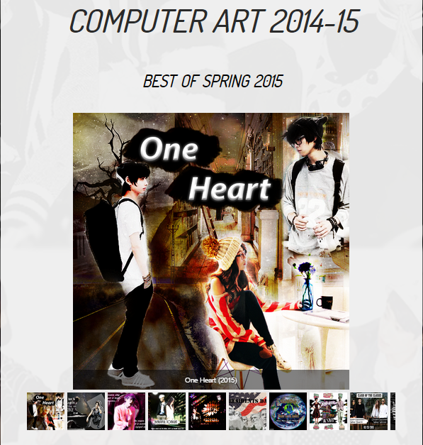
I made this photo edit with regard of a story that I was inspired by, of a love triangle between two boys and one girl. It's called "One Heart". I wanted to make the cover as dreamy as possible, so I added a little glow and I made the background overlay with a brown layer. I believe that I deserve an A to this artwork because It's very complex and the pictures are completely changed as much as possible.
03/02/15
March/April Events:April Fools
March/April Events:April Fools


week 7
02/27/15
Your Choice. Be sure to add the Reflection and Self-Grade section.
Your Choice. Be sure to add the Reflection and Self-Grade section.


This picture was made with a story in my head. It's a girl with two personalities. One of a bad girl and other of a kindhearted girl with a power in her. Her power is flower power, so I put a flower design on her face and she is glowing in the sun. I wanted more red in the image so I used a red texture to make the background have a red color. I think I deserve an A as I have met my requirements for it to be an original.
02/26/15
Your Choice. Be sure to add the Reflection and Self-Grade section.
Your Choice. Be sure to add the Reflection and Self-Grade section.


I have done an concept art for the Exo member Park ChanYeol. He is given the power of fire in his group and I wanted to show that by this artwork. I wanted to make it more fire color so I used glowing textures. I added the phoenix bird because it's I believe one of the symbol of fire. I think I deserve and A because the picture is changed completely for it to be seen as an original.
02/25/15
Thursday: Paparazzi Thursday
Thursday: Paparazzi Thursday


02/24/15
Baronial Spirit Week. Feb. 23-27, 2015
Wednesday: Clash of The Classes
Baronial Spirit Week. Feb. 23-27, 2015
Wednesday: Clash of The Classes


02/23/15
Critique: Benjamin Von Wong. Due: F. 2/27. All 4 parts. No more partners from this week on.
Critique: Benjamin Von Wong. Due: F. 2/27. All 4 parts. No more partners from this week on.

DESCRIBE: This is a photograph done by Benjamin Von Wong and it is called "Fallen Angel". I see a flower fairy, I believe, spotting the fallen angel on top of a tree branch. The flower fairy has a costume full of color. While the angel looks very broken. In the background there are trees and two other creatures. The picture is taken with lots of effort and costume design and makeup. Along with many more preparations.
ANALYZE: Since it is a photograph there is form in this work. There is color in green scale and brown for the forest and there is a variety of color used on the fairy's dress. Texture is not emphasized as in has a fantasy feel to it. There is movement as the fairy goes to the angel. There is balance as the elements are arranged wisely. There is proportion as you can describe where its location is and the picture is put together with unity.
INTERPRET: There is a fantasy feel to the photograph as he has used immortal looking creatures in his picture. It feel as if someone is approaching a strange person while the others watch. The sunlight in the background that is coming toward the front is giving the picture a very magical feel and makes it beautiful.
EVALUATE: I think this picture is very successful as he worked with much effort and passion to create a picture with a meaningful and beautiful scenario. He is also successful because he is doing something he loves and lives his life doing and putting effort to it. His success is also shown by the picture itself where he created an original picture with his own ideas and hard work and he achieved his goal. In other words, if he's happy with his work and if it is an original idea then it's successful.
SELF-GRADE: I believe that I deserve an A because I have passed my requirement of word count and vocabulary word. I also did some extra research of Benjamin Von Wong's "Fallen Angel" picture and watched the behind the scenes to do the critique and find the meaning of the picture. As following, I believe that I deserve an A on this critique and I enjoyed doing it.
week 6
02/20/15
Your Choice. Be sure to add the Reflection and Self-Grade section.
Your Choice. Be sure to add the Reflection and Self-Grade section.


This is the edit I made for a song called Beautiful Tonight originally made by Jonghyun Kim. I made this art in order to show the meaning of the lyrics and make a story out of it. I believe that I deserve an A because I changed up the picture a lot to stay away from copyright and to create an original. The picture can have a happy or a sad feel to it. It's up to the viewer to decide.
02/19/15
Baronial Spirit Week. Feb. 23-27, 2015
-Music Festival Monday
Baronial Spirit Week. Feb. 23-27, 2015
-Music Festival Monday


02/18/15
Critique: Shepard Fairey. Due: F. 2/20. All 4 parts. No more partners from this week on.
Critique: Shepard Fairey. Due: F. 2/20. All 4 parts. No more partners from this week on.

Shepard Fairey
KEYWORDS: Street art, stenciling, collage, screen printing, artist as businessperson, merchandising, branding
DESCRIBE: In this artwork, Shepard Fairey has mainly use lines, form, shape, space and color. Lines are used to create the the forms and shape of the artwork. Form is used because the the artwork defines a face of a standing figure of the Unites States. He uses color to show give his artwork the site of a poster by using colors like red, blue and white. His space or canvas is used to create this very popular artwork.
ANALYZE: Balance is defined in this artwork as this is aligned neatly and it shows unity in his work. Emphasis is used as the portrait of President Obama is contrasts with the background. The elements of design that is not shown in this artwork are repetition, patterns and movement, along with proportion, rhythm and variety.
INTERPRET: It has a professional look and the objective of making it a poster is clear. It has a comic, cartoon or poster feel to it. It this Artwork, Fairey, I assume is trying to portray that we have hope with the president. I think this because I feel his word "HOPE" under the president defines that.
EVALUATE: I think this artwork is successful as the original photographer liked it too event though he was too stingy that the artist got the money for it. In my opinion, it was Shepard Fairey's ideas to create it this way and the changes have been made accordingly. As long as his artwork doesn't mock or diss the figure he used, I suppose it completely original.
SELF-GRADE: I believe that I deserve an A because all the requirements were met, such as the word count and the use of vocabulary words. The picture was critiqued with my thoughts and opinions along with the information I learned recently. I also learnt that the photographer actually charged the artist with copyright law because he barely made money with his new creation but that creation is still respected.
02/17/15
"Best of Spring 2015" Slideshow. Create a slideshow with this title on your homepage. You can only use artwork created from Week 1 to 6 this semester. Pick at least 5 but no more 10 pieces that are are more original, not derivative, and where you wouldn't be sued over copyright infringement. This slideshow must have thumbnails.
"Best of Spring 2015" Slideshow. Create a slideshow with this title on your homepage. You can only use artwork created from Week 1 to 6 this semester. Pick at least 5 but no more 10 pieces that are are more original, not derivative, and where you wouldn't be sued over copyright infringement. This slideshow must have thumbnails.


week 5
02/12/15
Your Choice
Your Choice


02/11/15
Girls Basketball Team.
Girls Basketball Team.


02/10/15
Critique: Andy Warhol. Due: F. 2/12. All 4 parts. This week only, you can work with a partner. Credit both your names.
Critique: Andy Warhol. Due: F. 2/12. All 4 parts. This week only, you can work with a partner. Credit both your names.

Andy Warhol
KEY WORDS: Pop art, media, everyday objects as art, commercial products as art (Campbell's tomato soup can)m fashion, advertising, silk screen, iconography
DESCRIBE: This artwork created by Andy Warhol is a portrait of Marilyn Monroe who was a major sex symbol during the 1950s and 60s. Warhol's artwork would best be described as pop-art because of the use of imagery and theme that he incorporates from the modern pop culture. He has a variety of colors in this piece, all of them being bright. The way the colors are combined, it makes the artwork have a form. In terms of shapes, it is of her head and face. As for the background, it is a very simple baby blue that helps emphasis Marilyn Monroe's face.
ANALYZE: In this artwork, Andy Warhol used emphasis with contrasting color. The background is light ,so the foreground, who is Marilyn Monroe, is being emphasized. There is a little balance because the lines, color and shapes are arranged. There is no movement in this artwork as it is a portrait. No pattern or repetition because there is nothing repeating or showing a design. There is a variety of color and unity is used to align the colors so the picture is clear.
INTERPRET: Considering the use of bright colors, I would like to believe Andy Warhol was in a very cheerful mood. He was trying to open up the doors for pop art even more by creating artworks of celebrities. By doing this artwork, we think he was trying to portray respect to Marilyn Monroe because during this period, she was very well know.
EVALUATE: We think this work is successful as for this time period because if this kind of artwork was done during this time period it won't be seen as successful. Additionally this work is success because he satisfied his style of art. This artwork has used a descent amount of elements of art and principles of design. Another reason for success is that it attracts the eye of the viewer and emphasizes the main character. Like so, we think this artwork is a success
SELF-GRADE: Marissa and I believe that we deserve an A on this critique because we tried very hard on analyzing this artwork of Andy Warhol. We have met the word count for each section along with using as much as vocabulary words to describe and analyze the art. The work was divided fairly and worked together to meet the requirements.
02/09/15
Artist Powerpoint #2. Due: Th., 2/12.
Artist Powerpoint #2. Due: Th., 2/12.
| andy_warhol.pptx |
Week 4
02/06/15
Homage/Tribute Art to your PowerPoint #2 Assignment. Pick ONE of his/her and create a homage/tribute version. Upload the original and your homage here, and put both side by side on one of your powerpoint slides.
Homage/Tribute Art to your PowerPoint #2 Assignment. Pick ONE of his/her and create a homage/tribute version. Upload the original and your homage here, and put both side by side on one of your powerpoint slides.


02/05/15
March Event: 3/20 International Earth Day
March Event: 3/20 International Earth Day


02/04/15
Critique: Charley Harper. Due: F. 2/6. All 4 parts. This week only, you can work with a partner. Credit both your names.
Critique: Charley Harper. Due: F. 2/6. All 4 parts. This week only, you can work with a partner. Credit both your names.

Charley Harper (August 4, 1922 – June 10, 2007) was a Cincinnati-based American Modernist artist. He was best known for his highly stylized wildlife prints, posters and book illustrations. Born in Frenchton, West Virginia in 1922, Harper's upbringing on his family farm influenced his work to his last days. (wikipedia)
KEY WORDS: Nature, environment, conservation, science, shapes, color.
DESCRIBE: The composition of Charley Harper's artwork, is shapes, form, color, line and the space is very limited. The shapes are geometric such as triangles, circles, ovals and many others. The colors are all primary and complimentary colors as well. Throughout the artwork, you have a variety of colors being used to give the objects a realistic feel. The colors being used are brown, greens, red, pink, blues, yellow and black. His style is very simple and complex. His simplified forms are all of living objects found in nature. His background is a simple white to emphasis on the objects.
ANALYZE: In Charley Harper's artwork, he uses line, shape, space, and color out of elements of art. He mostly uses lines to show geometrical figures or animals in this case. Shape is used to draw the animals and unity is used so the shapes are put together giving a final artwork. Harper uses space to put all the possible animal in one canvas and a variety of colors are used to in every animal to show its identity. There is no repetition in this artwork because every animal is different. The background is white so it contrast with the colors used to identify all the animals in the foreground.
INTERPRET: I think Charley was in a very cheerful mood when creating this artwork. I feel like he was just trying to portray an everyday warm happiness and was trying to express the beauty of nature that we are surrounded by everyday. Also, I feel like he was in a peaceful mood.
EVALUATE: We think that Charley Harper's artwork is a success because he has shown his style of art throughout the artwork, which also shows that this is his original artwork. This artwork has many animals and insects that a person can enjoy watching because there is a variety of thing in it. We believe that this artwork is a success.
SELF-GRADE: Sithumini and I believe we deserve and A or B because we did our best to analyze and evaluate Charley Harper's artwork. Although, our describe and analyze sounds a like, we divided the work between each other and worked together to complete it to our best ability.
02/03/15
Your Choice (anytime, as long as you've finished or will finish the assigned work this week.)
Your Choice (anytime, as long as you've finished or will finish the assigned work this week.)


02/02/15
March Event. Create an artwork celebrating any of these events:
3/17 St. Patrick's Day
March Event. Create an artwork celebrating any of these events:
3/17 St. Patrick's Day


week 3
01/30/15
Kid Day Art. Due: End of class today. Enjoy.
Kid Day Art. Due: End of class today. Enjoy.


01/29/15
Your Choice (anytime, as long as you've finished or will finish the assigned work this week.)
Your Choice (anytime, as long as you've finished or will finish the assigned work this week.)


01/28/15
January Tutorial. Due: F., 1/30. Pick your best work from this month. Create a step by step guide where any student can follow and be successful.
January Tutorial. Due: F., 1/30. Pick your best work from this month. Create a step by step guide where any student can follow and be successful.

Step 1: Background.
Click File >New where you can edit your canvas size and open a canvas. Click File> Open where you can get the chosen pictures that you want the background to be. Crop the two pictures to the empty canvas that will created Layer 1 and Layer 2. Next, Re size the picture to the canvas' size so it creates background. Then is the filter so you wont get caught for copyright. Filter is done by clicking Filter> Filter Gallery where there is many filters that you can you to change your background. Then since the two pictures opacity is still on 100%, you can't see both of them. After the filter is done you change the opacity by clicking the opacity adjuster on the Layer Panel.


Step 2: Foreground.
Crop using Magic tool or Crop tool to crop out and copy and paste the pictures to your canvas that you made your background in. Then filter your pictures so you wont be charged for copyright. I decided I have to made the picture of Obama as same as the stones. To do this filter Layer 4 (Cutout Style) first, then you click Images> Adjustments> Hues and Saturation. Now you can play with the Hue/ Saturation panel to make Layer 4 look like a stone sculpture!


Step 3: Text.
Text in your artwork is done by clicking on the text tool of the tool panel. Then you can play with the settings on top of the Photoshop window where you can set the font style, color and warped text. After you are done with your artwork you, again go to File> Save as. If you want to keep this artwork to make changes you can save it as format Photoshop (*.PSD;*.PDD) Then you do the same process of saving but save it as format JPEG or PNG to open it as a picture. Then enjoy watching the artwork you created!


01/27/15
Critique: Simone Legno (tokidoki). Due: F. 1/30. All 4 parts. This week only, you can work with a partner. Credit both your names.
Simone Legno (tokidoki)
Critique: Simone Legno (tokidoki). Due: F. 1/30. All 4 parts. This week only, you can work with a partner. Credit both your names.
Simone Legno (tokidoki)

Simone Legno (born June 16, 1977) is an Italian artist best known for the creation of the tokidoki brand. Legno's designs are influenced by his interest in Japan and its culture, as well as street art and graffiti.
KEY WORDS: art as business/product/commerce, commercial art, branding, merchandising, Japanese art/manga, street art, iconography
DESCRIBE: Through Simone Legno's artwork, you can retrieve lines, bright colors and shapes. The space is very limited in the artwork due to all the different characters he has in the artwork. The use of color is all bright, such as yellow, red, pink, a sky blue and green. There is no dull color within the work.The shapes are all very round, there are a few stars in the artwork and flowers. The artwork can be a bit tricky to understand, there are a few different emotions in it. There are some sad characters and some calm and happy ones.
ANALYZE: In Simone Legno's artwork he uses lines, color, shape and space. Lines are used to draw every big and little characters on his artwork. There is a variety of color used in this artwork along with the variety of shapes that are used to create the characters. He uses all the space on his drawing space and completed the artwork. We believe that every character is emphasized by contrasting colors in the foreground and background. The whole artwork is a pattern as we see it because the artwork has some repetition. There is variety in this artwork as it has different form and notable contrasts, and different sizes and color.
INTERPRET: This artwork has many different emotions and moods to it. Simone shows happiness, sadness and calming creatures and characters all through out the artwork. The artist is trying to spread out his original characters along with different feelings and situations other may be going through. This is because he can attract the attention of his audience by emotionally connecting to them.
EVALUATE: I do believe this artwork was successful. It gives off good vibes and a cheerful emotion. I beleive a lot of it has to do with the bright colors. So even if the artwork has a sad story through it Simone makes his artwork bright and cheerful to make people realize that they should only focus on the bright side of things. Simone's artwork is everywhere now and is used for many things from clothing to accessories. He has collaborated with several industries such as Levis and Skull Candy and much more!
SELF-GRADE: Marissa and I believe that we deserve an A because we met our rules and requirements to this critique such as the word count and the vocabulary word. We passed the word count by passing fifty words each section. More than ten vocabulary words were used and described to evaluate and interpret the artwork. We believe that we critiqued the artwork thoroughly and gave a lot of thought to it.
01/26/15
Class Photo Artwork. Due: F., 1/30/15
Class Photo Artwork. Due: F., 1/30/15


Week 2
01/23/15
1. DLT.
2. Pick an activity from 1/20/15.
3. Your Choice (anytime, as long as you've finished or will finish the assigned work this week.)
1. DLT.
2. Pick an activity from 1/20/15.
3. Your Choice (anytime, as long as you've finished or will finish the assigned work this week.)


01/22/15
Your choice. Create a more original artwork that reflects at least 40 min. of work (and so it could be an art series if needed). Write:
- Artistic Statement/Reflection. One paragraph so I can understand your work. Themes, strengths, weaknesses, goals, ... of the work.
- Self-Grade (0-100%) and why.
- Due: End of class today.


Artist Statement: This artwork was inspired by Valentines Day. A day that people have romantic encounter. I wanted to use a lot of red because red is mostly used for gifts and decorations during valentines. I think I deserve an 98% because it was my original and I met the requirement of making them look less like the original picture. I used different picture to create one image that expresses Valentine Day. I took out two points because I realized after the artwork was done that I could add more to it.
01/21/15
Critique: Sarah Stieber. All 4 parts. This week only, you can work with a partner. Credit both your names.
Critique: Sarah Stieber. All 4 parts. This week only, you can work with a partner. Credit both your names.

Sarah Stieber
KEYWORDS: color, light, fun, whimsical, amplify real life, upcoming artist, "electric realism," wishful seeing
sarahstieber.com
DESCRIBE: In this artwork created by Sarah Stieber there are a ton of bright colors, the background of the piece is a backyard with a view of what seems to look like a wave and some grass and plants. The foreground of the work is of people swimming in a pool holding balloon animals that belong in the water. There is a lot of form being used to show the different shapes as well in this artwork. I believe it emphasizes the realism she is portraying. Sarah uses bright colors such as a bright green, yellow and pink. She uses a variety of different shaded blues as well.
ANALYZE: In this artwork there is a lot of variety that shows different types of forms and shapes that contrasts. Sarah Stieber emphasizes a lot of color in this artwork as much as her other ones. Movement is shown in this painting by showing the movement of the people that are swimming in the water. There is unity in her painting as we can describe the painting by pieces of information in it.
INTERPRET: Considering that she describes her body of work “whimsical ‘electric realism’ figurative paintings that aim to shine a brilliant light on daily life," We think Sarah Stieber was in a very cheerful, bright and hopeful mood. I think she was trying to portray a very positive attitude and message to all people. Meaning that they should see the positive things in life and focus on them. All her artwork are expressed through bright colors to give off a factual emotion of optimism.
EVALUATE: We think that Sarah Stieber's artwork is very successful because she met her standards by expressing happiness in her painting. She used a lot of bright colors by showing electric realism which is her style of art. Sarah shows her originality by emphasizing electric realism in this painting with her power of wishful seeing.
SELF-GRADE: Marissa and I believe that we deserve an A on this critique because we met the requirements by using the appropriate amount of vocabulary words and surpassing 50 words for every category. We also thought a lot about the artwork and worked together to put all the descriptions together. We evaluated it very thoroughly and put a lot of work into it.
01/20/15
February Event. Create an artwork celebrating any of these February Events:
Black History Month
2/2 Groundhog Day
2/14 Valentine's Day. Single Appreciation Day (SAD)
2/16 Presidents' Day
2/17 Mardi Gras
2/19 Chinese New Year (Year of the Sheep)
February Event. Create an artwork celebrating any of these February Events:
Black History Month
2/2 Groundhog Day
2/14 Valentine's Day. Single Appreciation Day (SAD)
2/16 Presidents' Day
2/17 Mardi Gras
2/19 Chinese New Year (Year of the Sheep)


Week 1
01/16/15
Critique: Margaret Keane. As good karma, just do the "Describe" section (50 words) since it's still Week 1. Due: End of class today.
Critique: Margaret Keane. As good karma, just do the "Describe" section (50 words) since it's still Week 1. Due: End of class today.

DESCRIBE: In this artwork I see a little girl wearing a kimono and Himalayan cat. Even though the girl has big eyes that was meant to be confusion and eyes that want to know more like curiosity as said by the painter, Margaret Keane, on the movie premiere video of the movie "Big Eyes". Colors are used such as classic white, red, black and skin tone. It was her original work even though it was once stolen from her ex-husband. The background is white and the foreground is where the girl and the cat is shown. Her big eyes, and the eyes that shows as if they are trying to say something is the emphasis of her work.
01/15/15
Beginning Computer Art Sample. Due end of class today. Using 1 picture below, create a welcome to BVHS, Spring 2015 artwork. Must work text. cropping, filter, ..
Beginning Computer Art Sample. Due end of class today. Using 1 picture below, create a welcome to BVHS, Spring 2015 artwork. Must work text. cropping, filter, ..


01/14/15
1. Winter Break Artwork(s). Due W., 1/14/15. End of class.
1. Winter Break Artwork(s). Due W., 1/14/15. End of class.


01/13/15
1. Museum Powerpoint #2. Due: F., 1/116/15. Same directions as last semester. Must be a another ART Museum.
Research a1n artist that you emulate. Critique his/her work, themes, struggles, inspirations, and upload some of their best. - - How many slides? As many as it takes to show how awesome this artist is.
- Homage/Tribute Art. Pick ONE of his/her and create a homage/tribute version. Put both side by side on one slide.
- Last slide should be a reflection, and must have his/her artist website.
| Louvre |
week 19
12/17/14
Final
1. Resume - Pre & Post.
- Upload first Day 1 Resume on the left side as a jpg. (Create one if you never made one.)
- Go to Word and create a post-resume updating all the skills you've acquired this semester (developing websites, creating posters/ads, using Photoshop ... Then save it as an image and upload to the right (lightbox too).

|

|
2. Critique (Just Describe and not the other 3 portions.)
2.1 DESCRIBE: What do you see in the artwork? (What kinds of composition, colors, lines, shapes and text do you see? What is it a picture OF?). At least 50 words and use at least 5 art terms.
2.2 Grade: From 0-100% Give a number grade for the artwork above and a short reason why.
2.1 DESCRIBE: What do you see in the artwork? (What kinds of composition, colors, lines, shapes and text do you see? What is it a picture OF?). At least 50 words and use at least 5 art terms.
2.2 Grade: From 0-100% Give a number grade for the artwork above and a short reason why.

In this artwork, I see shapes, lines, complimentary colors, and text. By lines the picture in the background is emphasized to show three children happily hugging. I believe the background, which is the three children, is made by two complimentary colors, red and white, as it contrasts each other. The picture has text to point out that it's a holiday picture/ poster. The picture uses colors of green, white and red to show Christmas colors, I believe. This picture is not a derivative picture as it evidently has given the original picture that was very different from this and it was taken by artist himself. I would give this artwork a 97% only deducting points for the text, that could have been more visible and a darker shade of green. It has a very good choice of color and it shows the Christmas holiday.
3. Self-Portrait. Create a mostly original self-portrait, self-grade and explain why. Artwork should reflect 30 min. or more.

|


|
I believe I deserve an A in this self-portrait, as it was made with a time period more than 30 min, because I used brush tool to color the background; hue/saturation to change the temperature and brightness; filter gallery to give each crop or layer a different filter (12 layers) ; and I used crop tool. I also believe that I deserve an A because it was an original.
4. Your Best Artwork Slideshow.
4.1 Put a Slideshow that previews your artwork here.
4.2 Pick at least FIVE but no more TEN of your best, most original and most creative artwork here.
4.3 Under the slideshow, put "Gallery" with a screenshot of that final artwork with the source images used to create it (so I'll know that you did create it.
4.4 Artistic Statement/Reflection: Write a 50 word reflection of this slideshow (i.e. themes, style/technique, strengths/weaknesses, growth, future goals ...).
The following slideshow of my best artwork consists of 8 pictures that are originally made by me. The slide contains pictures that reflect keywords such as, relationships, the National French Week, the Day of the Dead, Halloween, Cowboys Vs. Aliens, Clash/ Spirit Day, Juxtaposition and Labor Day. I used Photoshop to create the artworks and I believe that they are successful. My weakness in these artworks is the fact that I don't know how to improve them, since my knowledge on Photoshop is low. My strength is that I still tend to create artwork that impresses me with that knowledge. My future goal of improving my art is to learn more techniques and secrets of Photoshop that would help me improve my ways of expressing myself and my thoughts through art.
12/15/14
Catch Up.
Catch Up.
week 18
12/11-12/14
18.1. Create an ORIGINAL and COMPLEX artwork and upload it.
18.1. Create an ORIGINAL and COMPLEX artwork and upload it.


12/10/14
18.3 Critique (DESCRIBE). Write a 50 word critique describing this artwork by Norman Rockwell.
18.3 Critique (DESCRIBE). Write a 50 word critique describing this artwork by Norman Rockwell.

In this painting from the Four Freedom series, Norman Rockwell shows composition by illustrating a mixture of different faces. In the artwork, as of color has more of shades of brown and black. In the front of the picture or foreground, there is an African American person praying and in the background, there are people of different types who is praying along with him. I believe that the Rockwell shows juxtaposition in his artwork by having various races praying looking at the same direction, which gives us a information about the picture. I see font in this picture as there are text that has particular type of style. The artwork has good form as the painting has a three-dimensional feel to it.
12/8-9/14
18.2. Critique: Norman Rockwell. Go to the "Critique" webpage and find the artist. Copy and paste that entire section including his/her image and texts. Pick ONE of his/her artwork and then write a 50-word critique on each segment (Describe, Analyze, Interpret, Evaluate), for a total of 200 words. Must use at least 5 art terms and highlight them by changing the color. Use can partner up on this first critique, but put both names on your website.
18.2. Critique: Norman Rockwell. Go to the "Critique" webpage and find the artist. Copy and paste that entire section including his/her image and texts. Pick ONE of his/her artwork and then write a 50-word critique on each segment (Describe, Analyze, Interpret, Evaluate), for a total of 200 words. Must use at least 5 art terms and highlight them by changing the color. Use can partner up on this first critique, but put both names on your website.

Norman Rockwell illustrated covers for The Saturday Evening Post for 47 years. The public loved his often-humorous depictions of American life.
BIO: Norman Rockwell was born in New York City on February 3, 1894. Talented at a young age, he received his first commission at age 17. In 1916, he created the first of 321 covers for The Saturday Evening Post. Rockwell's Americana images were loved by the public, but not embraced by critics. He created World War II posters and received the Presidential Medal of Freedom in 1977. He died on November 8, 1978. (biography.com)
KEY WORDS: emotions, feelings, America, nostalgia, life, iconic, homage, small town life
DESCRIBE: In the artwork, "Shiner", the artist uses colors like red, green, brown mostly to show the school colors or show a professional place, I believe. The artist shows realistic lines, as in he draws realistically to show the viewer more meaning. The picture shows a kid who has got into a fight and has been sent to the principal's office. The principal and the mom or teacher looks shocked but the child is smiling; even though she has a black eye on her left side. By observing her appearance, she look like a very mischievous girl who has got into a fight by her untidy uniform and her wound on her knee.
ANALYZE: In this artwork, Norman Rockwell has used form, texture, balance, emphasis and proportion. He shows form by showing three- dimensional or realistic artwork; texture by giving a visual feel of how the objects in the picture would feel; balance by drawing perfectly arranged elements of art; emphasis by showing the girl in the center and having the girl with black eye in the foreground; and proportion by making the background predictably a school. There is a variety or different use of contrast, emphasis, size and color; and more in this picture. Space is used throughout the whole picture to show the site and situation. He uses color to make the picture that is drawn realistic. There is also a bit of pattern in the child's skirt, to show her uniform.
INTERPRET: There are different moods throughout the artwork, in my opinion, as the girl has a fake smile on her face and the principal has a shocked look on his face, while her mother looks disappointing. I believe, even though she smiling with pride for her doings, her smile is fake. The picture gives a sad mood. I feel the artist tried to portray humor.
EVALUATE: I think his painting is a success as he did a good job in getting the mood out of the viewer by showing a very playful child who had got into a fight and has a black eye, also caught and now in the principals office.
SELF-GRADE: I believe I deserve an A for this critique because I have given as much information as I about the painting and critiqued it by giving many vocabulary. I also say this because I believe I met the standards of the word count and other requirements in my critique.
Week 17
12/05/14
17.6 Critique. Banksy. Go to the "Critique" webpage and find the artist. Copy and paste that entire section including his/her image and texts. Pick ONE of his/her artwork and then write a 50-word critique on each segment (Describe, Analyze, Interpret, Evaluate), for a total of 200 words. Must use at least 5 art terms and highlight them by changing the color. Use can partner up on this first critique, but put both names on your website.
17.6 Critique. Banksy. Go to the "Critique" webpage and find the artist. Copy and paste that entire section including his/her image and texts. Pick ONE of his/her artwork and then write a 50-word critique on each segment (Describe, Analyze, Interpret, Evaluate), for a total of 200 words. Must use at least 5 art terms and highlight them by changing the color. Use can partner up on this first critique, but put both names on your website.

BIO: Banksy is a pseudonymous United Kingdom-based graffiti artist, political activist, film director, and painter. His satirical street art and subversive epigrams combine dark humor with graffiti executed in a distinctive stenciling technique. Such artistic works of political and social commentary have been featured on streets, walls, and bridges of cities throughout the world. (Wikipedia)
KEY WORDS: guerrilla art, street art.stencil, art in politics, vandalism
DESCRIBE: In this artwork I see a tired painters word "FOLLOW YOUR DREAMS" but on top of that says the word, "CANCELLED", which makes the message of the painter not strong anymore. I believe that this art work shows that the strong saying that people use a lot, "Follow Your Dreams", has been cancelled or violated by the environment around it. It shows, in my opinion, that dreams can't be followed because of the closed minded people and regulations.
ANALYZE: In this artwork, there is an emphasis, proportion, unity and balance. The artist shows emphasis by emphasizing the word, "Cancelled", making it stand out to our eyes. Balance is shown by arranging the pieces of the artwork to show us what's happening. Proportion is shown by the artist by painting or working on the actual size of the figure and making it effect the world. The artist shows unity by rounding up the graffiti and giving a message. I see shape in this artwork where "cancelled" is written on a red rectangle. There is a pattern as well, because the words, "Follow your Dreams" is written in a particular font. The art uses complimentary colors to emphasize the message. This artwork is evidently an original artwork of Banksy as it is not derivative.
INTERPRET: The artwork shows a fatigue painter by giving a tiring or a sad appearance to the painter of the meaningful words behind the words "Cancelled". He give a sad feeling to the graffiti work because the work represents sad things happening in the world.
EVALUATE: I think this art work is very successful because it shows the reality of the worlds environment and the situation of the people. This artwork effects me as well because the words, "Follow your Dreams" inspire me greatly but it is hard to do so because of the situation and the surroundings around us and the expectations that surrounds me that is way higher that what I want.
SELF-GRADE: I believe I deserve an A for this critique because I did my research well and found more meaning for this artwork by including my opinions and the value of the artwork in reality. This artwork also effects me and I was interested in finding more about it which made the critique better.
12/04/14
17.5 Homage/Tribute Art to your PowerPoint #2 Assignment. Pick ONE of his/her and create a homage/tribute version. Upload the original and your homage here in Week 17, and put both side by side on one of your powerpoint slides.
17.5 Homage/Tribute Art to your PowerPoint #2 Assignment. Pick ONE of his/her and create a homage/tribute version. Upload the original and your homage here in Week 17, and put both side by side on one of your powerpoint slides.


12/03/14
17.4 PowerPoint #2: Artist. Homage/Tribute Art. Pick ONE of his/her and create a homage/tribute version. Put both side by side on one slide.
17.4 PowerPoint #2: Artist. Homage/Tribute Art. Pick ONE of his/her and create a homage/tribute version. Put both side by side on one slide.
| simone.pptx |
12/02/14
17.3 Update your Portfolio Fall 2014 page from Weeks 1 to 16. Automatic D grade for this week if not complete.
17.3 Update your Portfolio Fall 2014 page from Weeks 1 to 16. Automatic D grade for this week if not complete.
12/01/14
17.1. Create an artwork about your Thanksgiving Break. Due: W., 12/3/14, beg. of class. Must reflect 40 min. of work or more.
17.1. Create an artwork about your Thanksgiving Break. Due: W., 12/3/14, beg. of class. Must reflect 40 min. of work or more.


week 16
11/21/14
1.5. Critique: Keith Haring. Go to the "Critique" webpage and find the artist. Copy and paste that entire section including his/her image and texts. Pick ONE of his/her artwork and then write a 50-word critique on each segment (Describe, Analyze, Interpret, Evaluate), for a total of 200 words. Must use at least 5 art terms and highlight them by changing the color. Use can partner up on this first critique, but put both names on your website.
1.5. Critique: Keith Haring. Go to the "Critique" webpage and find the artist. Copy and paste that entire section including his/her image and texts. Pick ONE of his/her artwork and then write a 50-word critique on each segment (Describe, Analyze, Interpret, Evaluate), for a total of 200 words. Must use at least 5 art terms and highlight them by changing the color. Use can partner up on this first critique, but put both names on your website.

BIO: Keith Allen Haring (May
4, 1958 – February 16, 1990) was an artist and social activist whose
work responded to the New York city street culture of the 1980's by
expressing concepts of birth, death and war. Haring's imagery has become
a widely recognized visual language of the 20th century. (Source:
Wikipedia.)
KEY WORDS: Pop art, graffiti art, activism
DESCRIBE: In this artwork we see a contrast of the colors black and orange. The artwork a very serious meaning of expressing that drugs are no good for anyone. The artwork is very complex due to its smooth lines and it consists of many different and connected parts. The artwork shares a very meaningful message and has a very serious tone to it.
ANALYZE: The important principles in this artwork are contrast, pattern, movement, emphasis, and there is some repetition. Keith Allen's also has a lot of artwork of lines. Keith shows pattern through out the artwork due to the repetition of the same figures. Movement is shown by -showing actions based on the text and figures because the viewer's eyes will follow were the figures and text eye throughout the artwork. Emphasis is also show in this work of art because Kieth Allen makes the skull and text "crack is wack" stand out the most. Lastly, repetition is used due to fact that lines, the figures and dots in the text are repeated throughout the artwork.
INTERPRET: We believe that Keith Allen was trying to express an awareness to all people but mostly to the younger generation. We feel that it was created to be a warning to all and out of nowhere Keith decided to create the artwork. We believe that his was trying to share a very inspiring and positive message to stay away from crack because it is no good.
EVALUATE: We feel the artwork was very successful with the given message to stay away from drugs because nowadays drugs are everywhere and people become very addicted He is trying to reach out and let everyone know that crack will get you no where in life, so stay away from it.
SELF-GRADE: Sithumini and I believe we deserve an A because we really put a lot of thought and evaluation into this artwork. We did everything that was required of us and we both put in an equal amount of work. We took the time to analyze Keith Haring's "Crack is Wack" artwork and learned a lot through just the art. We really took in all the evaluation and analyzes and are keeping the message close to us because we really agree with the message he is trying to send out.
11/20/14
1.4. Tutorial (November): Pick one of your best artwork, and make a clear, step-by-step guide on how to create it.
1.4. Tutorial (November): Pick one of your best artwork, and make a clear, step-by-step guide on how to create it.


11/19/14 Subwork
- Just pick any of the work from Mon., 11/17, and designate that as your subwork. Due: End of class today.
1.3. Powerpoint #2: Artist.
- Just pick any of the work from Mon., 11/17, and designate that as your subwork. Due: End of class today.
1.3. Powerpoint #2: Artist.
| simone.pptx |
11/18/14
1.2. Your CHOICE. Create an artwork of your own inspiration. Must reflect 40 min. of work or more.
1.2. Your CHOICE. Create an artwork of your own inspiration. Must reflect 40 min. of work or more.


11/17/14
1.1. Create an artwork on Thanksgiving. Must reflect 40 min. of work or more.
1.1. Create an artwork on Thanksgiving. Must reflect 40 min. of work or more.


week 15
11/14/14
1. Create an artwork on National French Week. Must reflect 40 min. of work or more.
2. Upload an artwork demonstrating today's art concept. Include title, year, artist, and website source .. onto the DLT page.
1. Create an artwork on National French Week. Must reflect 40 min. of work or more.
2. Upload an artwork demonstrating today's art concept. Include title, year, artist, and website source .. onto the DLT page.


11/13/14
1. Create an artwork on our Italian Exchange Program. Must reflect 40 min. of work or more.
2. . Upload an artwork demonstrating today's art concept. Include title, year, artist, and website source .. onto the DLT page.
1. Create an artwork on our Italian Exchange Program. Must reflect 40 min. of work or more.
2. . Upload an artwork demonstrating today's art concept. Include title, year, artist, and website source .. onto the DLT page.


11/12/14
1. Create an artwork on our 5 new school board members. It should reflect 40 min. or more of work.
2. Upload an artwork demonstrating today's art concept. Include title, year, artist, and website source .. onto the DLT page.
1. Create an artwork on our 5 new school board members. It should reflect 40 min. or more of work.
2. Upload an artwork demonstrating today's art concept. Include title, year, artist, and website source .. onto the DLT page.


11/10/14
1. Create a NEW artwork on for this class. Must have "Computer Art" on it, and reflect 40 min. or more of work.
1.1 If you have older artworks that's original and awesome, you can get extra credit by weaving "Computer Art" into it or them.
2. Upload an artwork demonstrating today's art concept. Include title, year, artist, and website source.
|
|
|


Week 14
11/7/14
1. Create an artwork on Native American Heritage Month (Nov.). Must reflect 40 min. or more of work.
2. Repetition. Upload an artwork demonstrating today's art concept. Include title, year, artist, and website source.
1. Create an artwork on Native American Heritage Month (Nov.). Must reflect 40 min. or more of work.
2. Repetition. Upload an artwork demonstrating today's art concept. Include title, year, artist, and website source.


11/6/14
1. Create an artwork on Veterans Day (Nov. 11).
2. DLT: Rhythm. Upload an artwork demonstrating today's art concept. Include title, year, artist, and website source.
1. Create an artwork on Veterans Day (Nov. 11).
2. DLT: Rhythm. Upload an artwork demonstrating today's art concept. Include title, year, artist, and website source.


11/5/14
Pick one of your best artworks from October. Create a clear, step by step tutorial on how you created it.
Pick one of your best artworks from October. Create a clear, step by step tutorial on how you created it.

|
Background:
Crop:
Text:
Filter:
|


11/4/14
Create an artwork on today's Election (i.e. governor, all 5 of our Sweetwater School Board Members, ...).
Create an artwork on today's Election (i.e. governor, all 5 of our Sweetwater School Board Members, ...).


11/3/14
Create an artwork on Dia de los Muertos.
Create an artwork on Dia de los Muertos.


week 13
10/31/14
Create an artwork about today's Halloween, or a collage of all the days in this Red Ribbon Week.
Create an artwork about today's Halloween, or a collage of all the days in this Red Ribbon Week.


10/30/14
Create an artwork about today's Clash Day (Mismatching Clothes)/Red Ribbon Week.
Create an artwork about today's Clash Day (Mismatching Clothes)/Red Ribbon Week.


10/29/14
Create an artwork about today's Workout Day/Red Ribbon Week.
Create an artwork about today's Workout Day/Red Ribbon Week.


10/28/14
Create an artwork about today's Twin Day/Red Ribbon Week.
Create an artwork about today's Twin Day/Red Ribbon Week.


10/27/14
Create an artwork about today's Pajama Day/Red Ribbon Week.
Create an artwork about today's Pajama Day/Red Ribbon Week.


WEEK 12
10/24/14
Create an artwork about Baron Pride or this week's overall Cream Cheeselake Spirit Week.
Create an artwork about Baron Pride or this week's overall Cream Cheeselake Spirit Week.


10/23/14
Create an artwork about Wear Pink/Breast Cancer Awareness.
Create an artwork about Wear Pink/Breast Cancer Awareness.


10/22/14
Create an artwork on today's Spirit Day (Wear Orange/Anti-Bullying Day)
Create an artwork on today's Spirit Day (Wear Orange/Anti-Bullying Day)


10/21/14
Create one of two pieces about:
Mon. - Tie-Dye Day
Tues. - Hipters vs. Jocks
Create one of two pieces about:
Mon. - Tie-Dye Day
Tues. - Hipters vs. Jocks


10/20/14
1. Crop (i.e. magnetic cropping tool)
2. Use stamp tool to create an artwork.
1. Crop (i.e. magnetic cropping tool)
2. Use stamp tool to create an artwork.


week 11
10/17/14
Midterm. 100 pts. Due at the end of class. Grade 0-100% and a short paragraph why. No SG, zero. You can use any technique or feature in Photoshop, Illustrator and/or paint (i.e. stamp, filter, opacity, ...). You don't have to use ALL these pictures bu you can ONLY use these images. And you must have text. Good luck.
Midterm. 100 pts. Due at the end of class. Grade 0-100% and a short paragraph why. No SG, zero. You can use any technique or feature in Photoshop, Illustrator and/or paint (i.e. stamp, filter, opacity, ...). You don't have to use ALL these pictures bu you can ONLY use these images. And you must have text. Good luck.
I think I deserve a 98 out of hundred because even though I used all the given options,but I think I could have improved by more complex work and a little bit more color, but I met the standards by using lasso tool, magic tool, opacity, hue/saturation, filter, brushes (stamp), and text.

10/16/14
1. Cropping assignment (i.e. magneitc lasso tool)
2. Midterm Practice. Go to "Gallery" and find last year's Halloween midterm. Due in 25 min. Follow all the rules. Self-Grade 0-100% and a short paragraph why. No SG, zero.
1. Cropping assignment (i.e. magneitc lasso tool)
2. Midterm Practice. Go to "Gallery" and find last year's Halloween midterm. Due in 25 min. Follow all the rules. Self-Grade 0-100% and a short paragraph why. No SG, zero.


10/15/16
School-wide Testing Day
School-wide Testing Day
10/14/14
1. Midterm is now on Th., 10/16/14.
2. Images --> Adjustment --> hue saturation.. Create an image that shows these techniques.
3. Midterm Practice: Use any photo, image, or artwork that you own or have copyright to, and apply these techniques and features:
text, crop, opacity, filter (hue,saturation, ...).


10/13/14
1. Opacity. Create an art project that uses opacity.
2. Midterm Practice: Create an artwork using only this/these images, but you must use these techniques or features:
text
filter
crop
opacity.
1. Opacity. Create an art project that uses opacity.
2. Midterm Practice: Create an artwork using only this/these images, but you must use these techniques or features:
text
filter
crop
opacity.


week 10
10/10/14, Subwork. Due: End of class today.
1. Create an artwork any of the Spirit/Homecoming Days this week (text, new background, ...). I.e. Tuesday was Cowboy vs. Aliens. Must show at least 30-40 min. of work.
1. Create an artwork any of the Spirit/Homecoming Days this week (text, new background, ...). I.e. Tuesday was Cowboy vs. Aliens. Must show at least 30-40 min. of work.


10/9/14, Subwork. Due: End of class today.
1. Create an artwork any of the Spirit/Homecoming Days this week (text, new background, ...). I.e. Tuesday was Cowboy vs. Aliens. Must show at least 30-40 min. of work.
2.. Reminder: Midterm is next Tuesday, 10/14/14.
1. Create an artwork any of the Spirit/Homecoming Days this week (text, new background, ...). I.e. Tuesday was Cowboy vs. Aliens. Must show at least 30-40 min. of work.
2.. Reminder: Midterm is next Tuesday, 10/14/14.


10/8/14, Subwork. Due: End of class today.
1. Create an artwork about the Homecoming Court (text, new background, ...) Must show at least 30-40 min. of work.
2.. Reminder: Midterm is next Tuesday, 10/14/14.
1. Create an artwork about the Homecoming Court (text, new background, ...) Must show at least 30-40 min. of work.
2.. Reminder: Midterm is next Tuesday, 10/14/14.


10/7/14
1. Photo of the Day including a caption with date and an explanation of the photo to prove that you took it.
2. Fall Break - Create an artwork depicting your Fall Break.
3. Reminder: Midterm is this Friday, 10/10/14.
1. Photo of the Day including a caption with date and an explanation of the photo to prove that you took it.
2. Fall Break - Create an artwork depicting your Fall Break.
3. Reminder: Midterm is this Friday, 10/10/14.


week 9
9/19/14
1. Photo of the Day
2. Just catch up on everything. *Remember: You need to post at least ONE artwork daily.
3. Write a TUTORIAL. Pick your best artwork (not GIF) or something that other students would really love to learn (i.e. erasing an image, fill, ...), and then create a step by step guide on how to create it. Use clear and simple language so that any beginner can follow. As an example, go to http://kramirezbvhs.weebly.com/ and click on his tutorials


9/18/14
1. Photo of the Day
2. Just catch up on everything.
3.*Remember: You need to post at least ONE artwork daily.
4. Pick at least ONE event in October and create an artwork for it. Due: End of Class.
Filipino American Heritage Month
Homecoming 7-10 p.m. Ruben H. Fleet Science Museum
Fall Break 9/22-10/6
Halloween
5. Tutorial of the Day. Follow Antonio Sanchez' tutorial and upload your work. Remember to include your source images, or upload in stages so I'll know it's your original work.


9/17/14
1. Photo of the Day
2. Just catch up on everything.
3.*Remember: You need to post at least ONE artwork daily.
4. Reminder: On your About Me page, you need a photo of your hand-drawn self-portrait asap. We'll need this for a future project.
5. Tutorial of the Day. Follow Raymond Tu's tutorial and upload your work. Remember to include your source images, or upload in stages so I'll know it's your original work.


9/16/14
1. Photo of the Day
2. No new work. Just catch up on everything now that weebly is working. You are responsible for some kind of artwork to upload today, even if it's an unfinished version.
*Remember: You need to post at least ONE artwork daily.
1. Photo of the Day
2. No new work. Just catch up on everything now that weebly is working. You are responsible for some kind of artwork to upload today, even if it's an unfinished version.
*Remember: You need to post at least ONE artwork daily.


9/15/14
1. Pick at least ONE event in October and create an artwork for it. Due: ASAP.
Filipino American Heritage Month
Fall Break 9/22-10/6
Halloween
2. Follow Tori Hallmark's tutorial on how to juxtapose an image, and then upload that artwork here. Due: ASAP.
3. Photo of the Day.
1. Pick at least ONE event in October and create an artwork for it. Due: ASAP.
Filipino American Heritage Month
Fall Break 9/22-10/6
Halloween
2. Follow Tori Hallmark's tutorial on how to juxtapose an image, and then upload that artwork here. Due: ASAP.
3. Photo of the Day.


week 8
9/12/14
1. Photo of the Day
2. No new work. Just catch up on everything.
*Remember: You need to post at least ONE artwork daily.
1. Photo of the Day
2. No new work. Just catch up on everything.
*Remember: You need to post at least ONE artwork daily.


9/11/14
1. Photo of the Day
2. No new work. Just catch up on everything.
*Remember: You need to post at least ONE artwork daily.
1. Photo of the Day
2. No new work. Just catch up on everything.
*Remember: You need to post at least ONE artwork daily.


9/10/14
1. Photo of the Day
2. No new work. Just catch up on everything.
*Remember: You need to post at least ONE artwork daily.
1. Photo of the Day
2. No new work. Just catch up on everything.
*Remember: You need to post at least ONE artwork daily.


9/9/14
1. A new Photo of the Day with a caption.
2. Photographic Self-Portrait is due.
3. Create a GIF of this photo self-portrait. Upload all 3 here. Recommend you put your photo self-portrait or GIF self-portrait on your homepage slideshow.
1. A new Photo of the Day with a caption.
2. Photographic Self-Portrait is due.
3. Create a GIF of this photo self-portrait. Upload all 3 here. Recommend you put your photo self-portrait or GIF self-portrait on your homepage slideshow.


9/8/14
1. Finish assignments from last week.
2. DAILY: Upload at least ONE or more of your best photos about SCHOOL LIFE, or something important to you.
3. This is PHOTOGRAPHY week!!!! Due: First thing tomorrow. Your PHOTOGRAPHIC Self-Portrait.
1. Finish assignments from last week.
2. DAILY: Upload at least ONE or more of your best photos about SCHOOL LIFE, or something important to you.
3. This is PHOTOGRAPHY week!!!! Due: First thing tomorrow. Your PHOTOGRAPHIC Self-Portrait.

week 7
9/5/14
- No new assignments.
- No new assignments.
9/4/14
Subwork:
1. Do not turn in quzzes today.
2. Pick at least ONE of the Comic-Crown Days next week and create an artwork/poster for it. Due: end of class today.
3. Work on Hispanic Heritage Month and Art Museum powerpoint.
Subwork:
1. Do not turn in quzzes today.
2. Pick at least ONE of the Comic-Crown Days next week and create an artwork/poster for it. Due: end of class today.
3. Work on Hispanic Heritage Month and Art Museum powerpoint.

|

|


9/3/14
Create at least TWO or more artwork or posters for next week's Comic-Crown/Spirit Week. DUE: ASAP.
Create at least TWO or more artwork or posters for next week's Comic-Crown/Spirit Week. DUE: ASAP.

|

|
9/2/14
1. Research and create an artwork/poster celebrating Hispanic Heritage Month 9/15-10/15.
2. Art Museum. Visit an art museum - VIRTUALLY! What unique artwork and/or features does it have? Create a powerpoint and upload it here. Your museum must be pre-approved by me first.
1. Research and create an artwork/poster celebrating Hispanic Heritage Month 9/15-10/15.
2. Art Museum. Visit an art museum - VIRTUALLY! What unique artwork and/or features does it have? Create a powerpoint and upload it here. Your museum must be pre-approved by me first.

|

|
| met.pptx |
week 6
8/29/14
Upload at least ONE of your best work from the theme/project of Week 1 to Week 6, plus the write-ups. Due: ASAP.
Upload at least ONE of your best work from the theme/project of Week 1 to Week 6, plus the write-ups. Due: ASAP.
8/28/14
Your Choice: Another Labor Day Artwork, or GIF.
Your Choice: Another Labor Day Artwork, or GIF.


8/27/14
GIF #2.
1. On your previous GIF projects, open the Photoshop file and do screen shot such as the sample below. (PC: use "Snipping Tools).
2. Make another GIF. GIF #1 should be on Photoshop. For GIF #2, go to gifmaker.me and try it. P.S. There's a 30% chance that no matter how hard you try, your GIF won't work. Try your classmate's PC if there GIF worked. Take a screenshot like the sample above to prove that you did it.
|
|
Credits:
www.smtown.com |


8/26/14
-Create at least one ARTWORK/POSTER celebrating Labor Day. Upload it here.
-Create at least one ARTWORK/POSTER celebrating Labor Day. Upload it here.
|
|


8/25/14
1. Create at least one GIF/Animation project. Due: End of class.
2. Write a tutorial. Pick your best artwork such as the GIF, and then create a step by step guide on how to create it. Use clear and simple language so that any beginner can follow. As an example, go to http://kramirezbvhs.weebly.com/ and click on his tutorials.

Tutorial Windows CS2:
1) Open Photoshop and create a new canvas.
2) File>Place the photo you want to filter and edit.
3) Go to Window> Animation
4) Open layers as normal and layers on the animation, accordingly. Set the time you want the layers to appear.
5) Save your art work by clicking File> Save as Web> Okay
1) Open Photoshop and create a new canvas.
2) File>Place the photo you want to filter and edit.
3) Go to Window> Animation
4) Open layers as normal and layers on the animation, accordingly. Set the time you want the layers to appear.
5) Save your art work by clicking File> Save as Web> Okay
Make sure your picture is small to fit on weebly
week 5
8/21-22/14
Create at least TWO (more preferred) pieces of art that features COLOR. This will be used for the GIF/animation assignment.
Create at least TWO (more preferred) pieces of art that features COLOR. This will be used for the GIF/animation assignment.
GIF #1


8/20/14
Your Choice.
Your Choice.

8/19/14
* Illustrator Assignment - Ch. 6. Follow the directions to Ch. 6, or improvise. Upload your final product here. Answer the End of Chapter questions and upload them here to. DUE: ASAP.
* Illustrator Assignment - Ch. 6. Follow the directions to Ch. 6, or improvise. Upload your final product here. Answer the End of Chapter questions and upload them here to. DUE: ASAP.

8/18/14
Create an artwork for OPEN HOUSE. Must have this info: Bonita Vista H.S., Thursday, Aug. 21, 2014, 6-8pm.
Create an artwork for OPEN HOUSE. Must have this info: Bonita Vista H.S., Thursday, Aug. 21, 2014, 6-8pm.

Week 4
8/15/14
* Vivian Monteagudo-Style Abstract Art. Use Paint and draw something like a shark for this week's portfolio.
* Vivian Monteagudo-Style Abstract Art. Use Paint and draw something like a shark for this week's portfolio.


8/14/14
* Colin Aguilar-Style Abstract Art. Use the "Rectangle Tool" under the Text Tool.
* Colin Aguilar-Style Abstract Art. Use the "Rectangle Tool" under the Text Tool.


8/13/14
* Shark Week. Create at least ONE artwork for Shark Week. You can use the images below, or others.
* Shark Week. Create at least ONE artwork for Shark Week. You can use the images below, or others.


Illustrator Assignment - Ch. 5. Follow the directions to Ch. 5, or improvise. Upload your final product here. Answer the End of Chapter questions and upload them here to. DUE: ASAP.

Week 3
Abstract Art #1. Due: F. 8/8/14. Use Paint, Illustrator, or Photoshop to create an original piece of abstract art. Samples below. To prove that you did indeed create this artwork, upload the original file as well using the "doc/File" button. Or upload your artwork in stages so we can see the progress.


Illustrator Assignment - Ch. 4. Follow the directions to Ch. 4, or improvise. Upload your final product here. Answer the End of Chapter questions and upload them here to. DUE: ASAP.

Illustrator Assignment - Ch.3. Follow the directions to Ch. 3, or improvise. Upload your final product here. Answer the End of Chapter questions and upload them here to. DUE: ASAP.


Photoshop Assignment - p. PS 71-77. Make an artwork based on p.PS 74-76 "Step by Step 4.3. Due: ASAP.


Illustrator Assignment - Ch. 2. Follow the directions to Ch. 2, or improvise. Upload your final product here. Answer the End of Chapter questions and upload them here to. DUE: F., 8/8/14.

End of Chapter questions:
1. The difference between the art board and scratch board is that the art board is the space you draw and work on and scratch board is the place where you can doodle and edit on.
2. The non-printable area is indicated by a black thin line.
3. Ai. indicates Adobe Illustrator.
4.Tool tips are when you bring your cursor to the selected tool it shows what it is and you can turn them off on the preferences panel.
5.Allows you to see more accurately where your brush strokes will appear.
6.Shortcut to undo mistakes is Ctrl+Z.
7.If you exit the illustrator you can reset the preferences.
8.View > Actual Size sets the document to 100% scale and View > Fit in Window magnifies file to fit window area.
TEXT Artwork #2. Due: M., 8/4/14. Using Photoshop, create a different artwork just with WORDS or TEXT. Use as many fancy text styles as possible. Put your name in it so I know it's your original work. At least 20 words or more.

WEEK 2
Text Artwork. Due: End of class, 7/31/14. Using Photoshop, create an artwork just with WORDS or TEXT. Use as many fancy text styles as possible. Put your name in it so I know it's your original work. At least 20 words or more.

Artwork. Due: W., 7/30/14. Create any artwork in Photoshop or Illustrator, and then upload it here (with the correct title/label). Play around with Filter, 3D and TEXT. Of course, you can put more than one sample artwork.Put the original image up, and then the final artwork. Write a very short paragraph explaining what you did.
This picture was taken by my own gallery and it's not taken from else where. I used the 'Accented Edges' as a filter and typed a text which says "Roses are beautiful... but it may harm you...If you harm it..." I think roses are very beautiful but it can harm you sometimes, when you try to harm it.
This picture was taken by my own gallery and it's not taken from else where. I used the 'Accented Edges' as a filter and typed a text which says "Roses are beautiful... but it may harm you...If you harm it..." I think roses are very beautiful but it can harm you sometimes, when you try to harm it.


Artwork. Due: T., 7/29/14. Create any artwork in Photoshop or Illustrator, and then upload it here (with the correct title/label). Put the original image up, and then the final artwork. Write a very shot paragraph explaining what you did.


week 1
Resume Due: ASAP. Create a truthful resume based on all your skills and experiences as of today. Pls. mention: skills in Photoshop, editing, language skills, acting/directing, singing, ... Self-Grade and why. 100 pts.

Photoshop Assignment - p. PS 59-70. Make a artwork based on p.PS 68-71 "Step by Step 4.1). Due: ASAP.
